
As business owners, we need to regularly keep an eye on all the important activities and processes in our business; figure out which areas are doing well and scale them, find out which areas are not doing well and fix them. However, without measurable and immediate feedback, it is difficult to figure out what’s working and what’s not.
From customer transactions to purchasing behaviors to complaints, startups have a wide range of data just waiting to be harnessed. However, all this data that’s being created by people and devices doesn’t provide founders and other decision makers with valuable insights on its own. It must be analyzed to get any meaningful value. To discover new business opportunities, startups need to be able to analyze and interpret data in real-time.
Data visualization techniques and tools offer founders, key stakeholders and other decision makers the ability to quickly grasp information hiding in their data.
Here are 4 ways startups can use data visualization to grow their business faster:
1. Absorb information easily
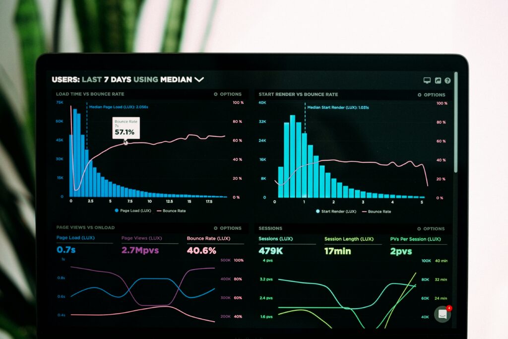
Data visualization enables users to view and understand vast amounts of information regarding operational and business conditions. For example, each startup relies on multiple systems such as marketing tools, social media channels, website data and payment gateways to function smoothly. It is time-consuming to regularly log into each system to find out how your business is performing. Data visualizations can help you easily keep track of all the important trends and numbers that matter to your business like total sales, daily sales and number of new visitors/customers. You can even view historical trends to understand how your business has grown over time.
You can easily use a bunch of visualizations to display performance trends from the various systems in your startup and pin them onto a dashboard, to monitor them regularly from one place. This allows decision makers to see connections between multi-dimensional data sets and provides new ways to interpret data through trend charts, heat maps, bullet charts, and other rich graphical representations. Startups that use visual data analytics are more likely to find the information they are looking for and sooner than other companies.
2. Discover relationships and patterns between business and operational activities
Data visualization enables users to effectively see patterns and relations that occur between operations and business performance. It’s easier to see how your day-to-day tasks impact your overall business performance, and find out which operational change triggered the growth/dip in business performance. For example, you can measure the impact of your latest marketing campaign or pricing change on your sales trends.
Data visualizations can be used to see historical trends in the key performance metrics, like monthly sales or new weekly signups, of your startup. This allows you to compare the current performance with the past, and forecast the future. You can even break it out by various components that drive the metric, such as the sales by various sources or regions. Further, you can drill down to see their historical trends and contributions.
This allows you to identify the reason for growth and repeat it, or find the root cause of the dip and fix it.
3. Identify emerging trends faster
The amount of customer and market data that startups are able to gather can provide key insights into new business and revenue opportunities. To avoid getting lost in the mountain of data, it needs to be simplified. That’s where data visualization comes in. Data visualization enables founders and key decision makers to spot changes in customer behavior and market conditions more quickly. For example, visualizing number of signups by source can tell you where users came across your site and indicate how your marketing efforts are performing. You can see how much traffic each marketing channel brings in and how relevant it is, i.e., how many of them signup. Once you know which channel brings in most signups/downloads, you can assign more resources to it.
Visualizing customer behavior trends will tell you what kind of users find value in your product or service. You can find out variations in customer preferences based on their location, age, industry, etc. This allows you to segment your customers by age, location, etc. and provide more features or products tailored to each segment. You can even offer products which complement the ones used by these customer segments, and manage inventory better. For instance, if you see that most of the customers on your ecommerce site are women aged 25-35, you can probably increase the inventory of women’s footwear and give discounts on them, reduce the inventory of men’s footwear.
4. Get actionable insights and respond quickly
Data visualization enables you to bring actionable insights to the surface. Unlike tables and charts which can only be viewed, data visualization tools enable users to interact with data. For example, a canned report or Excel spreadsheet can inform an ecommerce business owner that sales for a certain category of products are down for a particular month. However, it won’t inform her why the sales are down. Using real-time data visualization, the executive can view the latest sales figures, find out which products are under performing and the reason for drop in sales – discount offered by competitors. The founder can then take action to respond quickly. For example, she might launch a 15-day sales promotion for specific brands or products whose sales numbers have dipped.
Data visualizations empower startups to quickly get meaningful insights from their data, understand how their business is performing, capitalize on growth opportunities and spot risks early on.
Sreeram Sreenivasan is the founder of Ubiq, a new business intelligence and reporting application.